
🔎 Focus: Web performance
🔴 Impact: High
🟢 Difficulty: Low

Sponsored by Ahrefs
Want to automate the grunt work?
Meet Agent A, the AI teammate with full access to your Ahrefs data. From fixing keyword cannibalization to shipping technical reports straight into Notion or Google Docs, it does the work you’d rather not.
The Core Web Vitals Number You're Chasing Was Never Yours
There's a specific dopamine hit that comes with a green checkmark in a performance report. Your Largest Contentful Paint lands under 2.5 seconds, the dashboard turns green, everyone nods, and the team moves on to the next ticket.

I want to talk about why that green checkmark might be lying to you.
New research from Tammy Everts at Embrace, the team behind SpeedCurve, pulled real user data from ten online retailers and plotted it against engagement.
The result is uncomfortable if you have been treating 2.5 seconds as a finish line. For every single one of those sites, the point of best engagement arrived well before Google's "good" threshold. For several of them, it arrived a very long way before.
Here is what the research found, and what I think it actually means for how we do technical SEO.
I. Where 2.5 seconds comes from
Google's threshold for a "good" LCP is 2.5 seconds. That number has become the industry default. Hit it, collect your green checkmark, close the ticket.
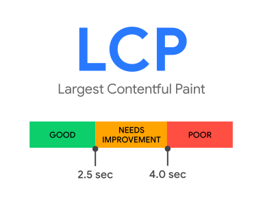
The problem is not that the number is wrong. The problem is where it comes from. It is an aggregate, drawn from millions of sites across every category you can imagine. It describes what fast looks like in general.
It knows nothing about your product, your users, or your revenue. "The average site" and "your site" are two very different things, and treating one as a stand-in for the other is where a lot of teams quietly lose ground.
II. What the research actually measured
Tammy pulled a month of real user monitoring data from ten retailers. Then she built a correlation chart for every site, plotting session-level LCP against bounce rate.
She could see, at a glance, how engagement moves as the page gets faster or slower.
She used bounce rate rather than conversion rate for a practical reason. Bounce is captured by default in most RUM tools, so there is no extra instrumentation to set up, and it works as a solid directional proxy. Where you see a relationship between speed and bounce, there is usually a matching relationship with conversion sitting right behind it.
III. Finding one, the sweet spot was nowhere near 2.5 seconds
Across all ten retailers, the optimal LCP, the point tied to the best bounce rate, landed somewhere between 100 milliseconds and 1 second.
Not 2.5 seconds. Every one of these sites saw its best engagement comfortably ahead of Google's "good" mark.
Now, the important caveat, and Tammy hammers this point herself. That range is not a new target to chase. It is not "the real number" to swap in for 2.5 seconds. That would be repeating the exact mistake, just with a smaller figure.
What the range tells you is something more useful. "Good enough" for real users on real sites can be dramatically faster than the industry standard implies. The only way to know your number is to look at your own data.

The 2.5 second LCP was generating still high bounce rate
IV. Finding two, some sites had already flatlined
This is the finding that should make you sit up.
The performance plateau, the point where shaving off more milliseconds stops moving engagement, started somewhere between 500 milliseconds and 5.6 seconds across the ten sites. Wide variance, no surprise there.
The surprise was that for four of the ten sites, the plateau began before 2.5 seconds. By the time those sites hit Google's "good" threshold, they had already bottomed out on bounce rate.
Four sites were technically fast enough for Google and had already extracted every bit of engagement that speed was going to give them. The green checkmark, in those cases, was measuring a race that finished a while ago.
V. Why an aggregate breaks on a real site
This is the part that matters for us as practitioners, because it changes what a target even is.
A global threshold assumes every site has the same relationship between speed and behaviour. They do not.
A content-heavy fashion retailer, a fast checkout flow, and a sprawling B2B catalogue all have different users, different intent, and different tolerance for latency.
When you inherit a universal number, you get one of two failure modes. Either the threshold is too slow, so you pass the audit while leaving engagement on the table, which is the four-sites problem above. Or the threshold is too fast for your context, so you burn engineering weeks chasing milliseconds that were never going to move a business metric.
Both are expensive. Both are invisible if the only thing you are looking at is whether the dashboard turned green.
VI. The plateau is the real conversation
The performance plateau is the concept I wish more teams built into their planning.
Below the plateau, speed is doing real work. Every improvement pulls bounce down and pushes engagement up. This is where optimisation earns its keep.
Beyond the plateau, you are optimising for nothing. The curve has gone flat. More speed is still nice, but it is no longer buying you a business outcome, and the engineering time would return more somewhere else.
Knowing where your plateau sits turns performance from an open-ended grind into a decision. It tells you when to keep pushing and, just as importantly, when to stop and redeploy the team. That second call is one almost nobody makes, because "faster is always better" is easier to say than "we have done enough here."
VII. How to find your own number
The good news is that the method is not complicated, and it is the actual takeaway of the research. Treat it as a methodology, not a figure.
First, pull your own RUM data. Field data from real sessions, not a synthetic lab score.
Second, build a correlation chart plotting LCP, or any other user-facing metric like Interaction to Next Paint, against bounce rate.
Third, find two points on that curve. Where is bounce actually at its best, and where does your plateau begin.
Fourth, set your performance goals from those two points. Not from a number derived from millions of sites you do not run.
Your optimal LCP might come out at 1.8 seconds. It might be 400 milliseconds. It might be 4 seconds. There is no way to know without looking, and that is the whole point. If these ten retailers are any signal, "fast enough" is probably faster than you have been told, and 2.5 seconds as a finish line may be costing you engagement you never knew you were losing.
What this changes about how we work
I keep coming back to this research because it lines up with something I believe about technical SEO in general. The technical SEO value is in understanding your specific site well enough to make good calls on it.
A static audit that says "get LCP under 2.5 seconds" is repeating a number off a chart. It sounds authoritative, and it is easy to hand over. It also might be pointing the dev team at the wrong goal entirely, either too soft or too aggressive for the site in front of them.
Sit inside the workflow where the fixes actually ship, and let real user data set the target. That is slower to say in a pitch and far more honest in practice.
Core Web Vitals matter. The relationship between page speed and business outcomes is real, and it holds up chart after chart.
What is worth questioning is the assumption that Google's threshold and your threshold are the same thing. They are not.
Go pull your own data and find out where your finish line actually is.
Is your site fast enough?
Reply to this email with “Speed” and your e-commerce domain.
I am selecting ONE site to do a free technical SEO analysis including site speed.
Seeeeee you soon 👋

oh that’s a human
—